Project Notes
Year
2026
Services
Website Design
Website Development
Restaurant Website Design
UI/UX Design
Online Booking System
Responsive Development
Custom Illustration
SEO Foundations
Stack
Overview
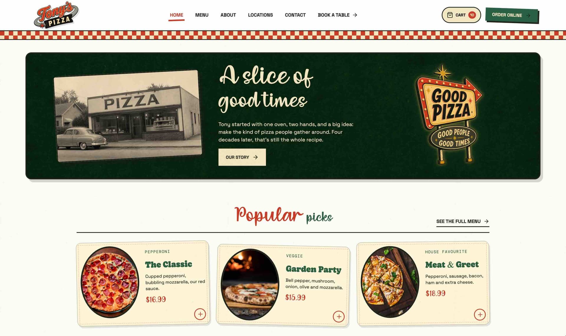
Tony’s Pizza is a concept restaurant website created to show how a strong, nostalgic identity can be translated into a modern digital experience without losing its personality.
The visual direction draws from classic neighbourhood pizza restaurants, vintage food packaging, hand-painted signage and mid-century advertising. Warm colours, distressed textures, checkerboard details, illustrated mascots and bold typography give the website a distinctive character from the moment it loads.
The project was designed as more than a visual concept. Alongside the expressive art direction, the website includes the structure and functionality expected from a real hospitality business, including menu browsing, location information, opening hours, contact details and a complete table-booking journey.
The result is a playful but practical website that could be adapted for an independent pizza restaurant, bar or casual dining brand looking to stand apart from generic restaurant templates.
The Challenge
Restaurant websites often prioritise either appearance or functionality, but rarely both.
Many functional restaurant websites rely on predictable layouts, generic photography and third-party booking tools that feel disconnected from the brand. At the other end of the spectrum, highly stylised websites can become difficult to navigate, especially when decorative elements compete with essential information.
The challenge was to create a website that felt energetic, memorable and visually original while keeping the customer journey simple.
Visitors still needed to be able to quickly:
Browse the menu
Find opening hours
View restaurant locations
Choose between dining in, takeaway and delivery
Book a table
Contact the restaurant
The design also needed to retain its personality on mobile devices. Large typography, illustrated characters, layered imagery and print textures can easily become overwhelming on smaller screens, so every section required a responsive, intentionally art-directed layout.
The table-booking process presented another challenge. It needed to feel like a natural extension of the website rather than a generic form added after the design was complete.
The Solution
I created a custom design system inspired by vintage pizza boxes, printed menus, roadside signage and traditional restaurant advertising.
The colour palette combines warm cream, tomato red, dark green, mustard and near-black. Distressed paper textures, imperfect borders and subtle grain help the digital interface feel more tactile and printed.
The homepage uses a bold editorial composition rather than a conventional restaurant template. Oversized typography and a custom pizza-slice mascot establish the visual identity immediately, while clear calls to action direct visitors towards ordering online or reserving a table.
Real food and restaurant photography is used alongside the illustration work to keep the website grounded and believable. Images are presented through postcard, scrapbook and vintage-advertisement-inspired layouts so they feel connected to the wider design language.
The website includes:
A character-led homepage
A structured food and drinks menu
Featured and popular menu items
Restaurant story and brand content
Location and opening-hours information
Contact details and enquiry options
Dine-in, takeaway and delivery messaging
A complete online table-booking flow
A protected booking-management area
The booking system allows customers to select a location, date, time and party size before submitting their contact and reservation details.
Availability can be controlled through configurable opening hours, booking windows, closed dates, party-size limits and timeslot capacity. This makes the booking function suitable for a real restaurant rather than acting as a front-end demonstration only.
Animations are used selectively throughout the experience. Headings, illustrations and smaller decorative elements reveal with subtle movement, adding energy without slowing down the site or interfering with navigation.
The Result
The completed website feels playful, distinctive and immediately recognisable while remaining clear and practical to use.
The retro identity extends through every part of the experience rather than being limited to the logo or homepage. The menu, photography, booking forms, buttons and supporting pages all feel like parts of the same restaurant brand.
Responsive layouts preserve the expressive typography and illustration work across desktop, tablet and mobile. Instead of simply stacking the desktop sections, the mobile layouts are adjusted to maintain hierarchy, readability and visual impact.
The integrated booking journey gives the website a clear commercial purpose. Customers can move from discovering the restaurant to selecting a table without being pushed into a visually disconnected third-party experience.
As a concept project, Tony’s Pizza demonstrates how a hospitality website can move beyond common templates and become a stronger part of the restaurant’s identity and customer experience.